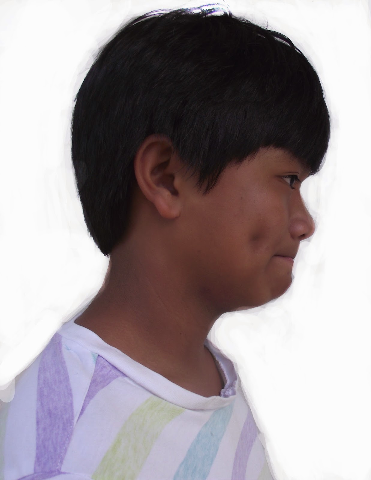
Portrait photography is a picture of the side of someone's face. It can't be called a portrait if you can see both eyes of the person's face. Another word for portrait often used by photographers is the word profile, basically the same concept but with a different word. It relates to
silhouetting because you can't really see any details of the project face really, but only the outline which somewhat resembles silhouetting.
 |
| Process of Final Project |
Double Exposed Portraits can be made in Photoshop by first resizing the person's face to fit the page. Then you use this dodge tool which when used makes a white background which you need for the portrait. Then you stack the two pictures that symbolize you! It could be a logo, your favorite place, your favorite food, etc. You then blend the pictures that symbolize you and the portrait to make one picture. I thought this was pretty neat and I wanted to try it because when I saw other finished product of Double Exposure I thought of how neat it looked and I really wanted to try it and plus I thought it would be really cool to try to symbolize how I am in a whole.
My symbols was a cloud with the sun behind it and a tree taken from
the below. The cloud was a symbolism of free-flowing spirit which was
suggested by a friend. The tree symbolized that I like to branch out and
find the brightest spots of life, just like a tree searches for the
brightest spot of sunlight. I could have improved by placing the two different pictures so that they covered every part of my body and yet the placement still made sense. I could have also made the two pictures more prominent and easier to find and distinguish but other than that I actually feel pretty good about it and honestly I think I'm better at Photoshop than I was last year.
 |
| Final Project |
 |
| Practice Double Exposure |

I love the angle you took the tree photo from ! Great symbolism ! (:
ReplyDeleteGreat final!!!!
ReplyDeleteYour use of headroom in the final.
Great colors!!!!
I like the vibrance of your colors.
ReplyDeleteOne thing that could be improved is the message that you are trying to share.
I like the quality of your pictures.
The blue in your picture is really vibrant.
ReplyDeleteI can tell what your symbols are, which makes your message work.
You should place your images better.
i really like your images/
ReplyDeleteNo head room
i like the adjustment layers you used.
I like the colors!
ReplyDeleteYou can't see both images very well
The over all image works well together
Compliment: Great symbolism
ReplyDeleteImprovement: Your cloud doesn't look like a cloud
Compliment:Great colors
I like your symbols.
ReplyDeleteI don't know what your trying to say with your image and also its hard to see what your symbols are.
Nice job.
Good final!
ReplyDeleteThere's no headroom at the top.
Nice symbols.
cool trees, not enough space for the top for your head, very nicely green,
ReplyDelete